How to Choose the Perfect Color Palette for Your Home
Find the perfect color palette for your home with expert tips on choosing harmonious shades that enhance your space and reflect your style.

Choosing the right color palette for your home is more than just a design choice—it’s a way to create a mood, enhance your space, and bring harmony to your surroundings. The right colors can make a room feel spacious, cozy, elegant, or even energizing. But with so many options available, it can be difficult to know where to start.
Whether you're a renter looking to refresh your space, a homeowner designing your dream home, or an interior designer crafting stunning interiors, selecting the perfect color scheme is a crucial step in making a house feel like home. This guide will walk you through the essential considerations for choosing colors that complement your space and reflect your personal style.
1. Understand the Psychology of Colors
Understanding the psychology behind colors is an important first step in choosing the right palette for your home. Different shades evoke different emotions, so selecting colors based on the atmosphere you want to create is key.
Warm colors, such as reds, oranges, and yellows, bring energy and vibrance to a room. These shades work well in social spaces like living rooms and kitchens where you want to encourage conversation and warmth. On the other hand, cool colors like blues, greens, and purples promote relaxation and are best suited for bedrooms and bathrooms, where a calming atmosphere is ideal.
Neutral tones, including whites, beiges, and grays, offer versatility and balance. They create a clean backdrop that allows furniture and decor to stand out while maintaining a timeless and sophisticated aesthetic. By considering the emotional impact of colors, you can create spaces that feel as good as they look.
2. Find Inspiration from Existing Elements
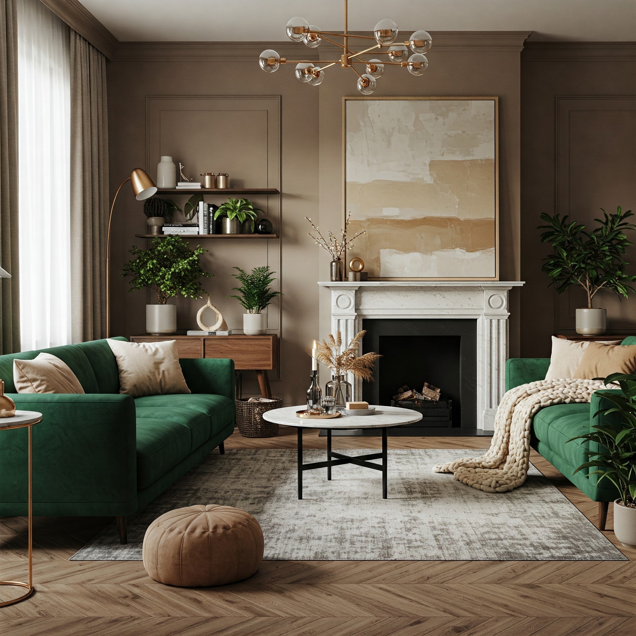
Before settling on a color scheme, take a look at the elements already present in your home. Existing furniture, flooring, and architectural details can serve as a great starting point when choosing colors. If you have a statement piece, such as a bold sofa or a beautifully patterned rug, you can pull colors from those elements to build a cohesive palette.
Natural materials like wood, stone, and brick also play a role in color selection. The warm tones of oak flooring or the cool hues of marble countertops can help guide your decision-making. Working with what you already have ensures that your new colors will complement your space rather than clash with existing features.
For homeowners looking for a professional approach to blending color with design, BuildTX Solutions offers expert guidance in creating a space that is both beautiful and functional.
3. Stick to the 60-30-10 Rule for Balance
A well-balanced color scheme doesn’t happen by accident. The 60-30-10 rule is a simple design principle that helps distribute colors in a way that is visually appealing and harmonious.
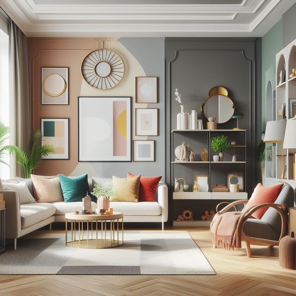
The dominant color should cover about 60% of the space. This is typically used for walls and large furniture pieces, providing a foundation for the rest of the room. A secondary color should make up about 30% of the space, often appearing in curtains, rugs, or accent furniture. The final 10% is reserved for an accent color, which is introduced through smaller decor elements like pillows, artwork, or vases.
By following this formula, you can create a room that feels intentional rather than overwhelming. This method ensures that colors are layered thoughtfully, making your space feel cohesive and well-designed.
4. Consider Undertones for a Cohesive Look
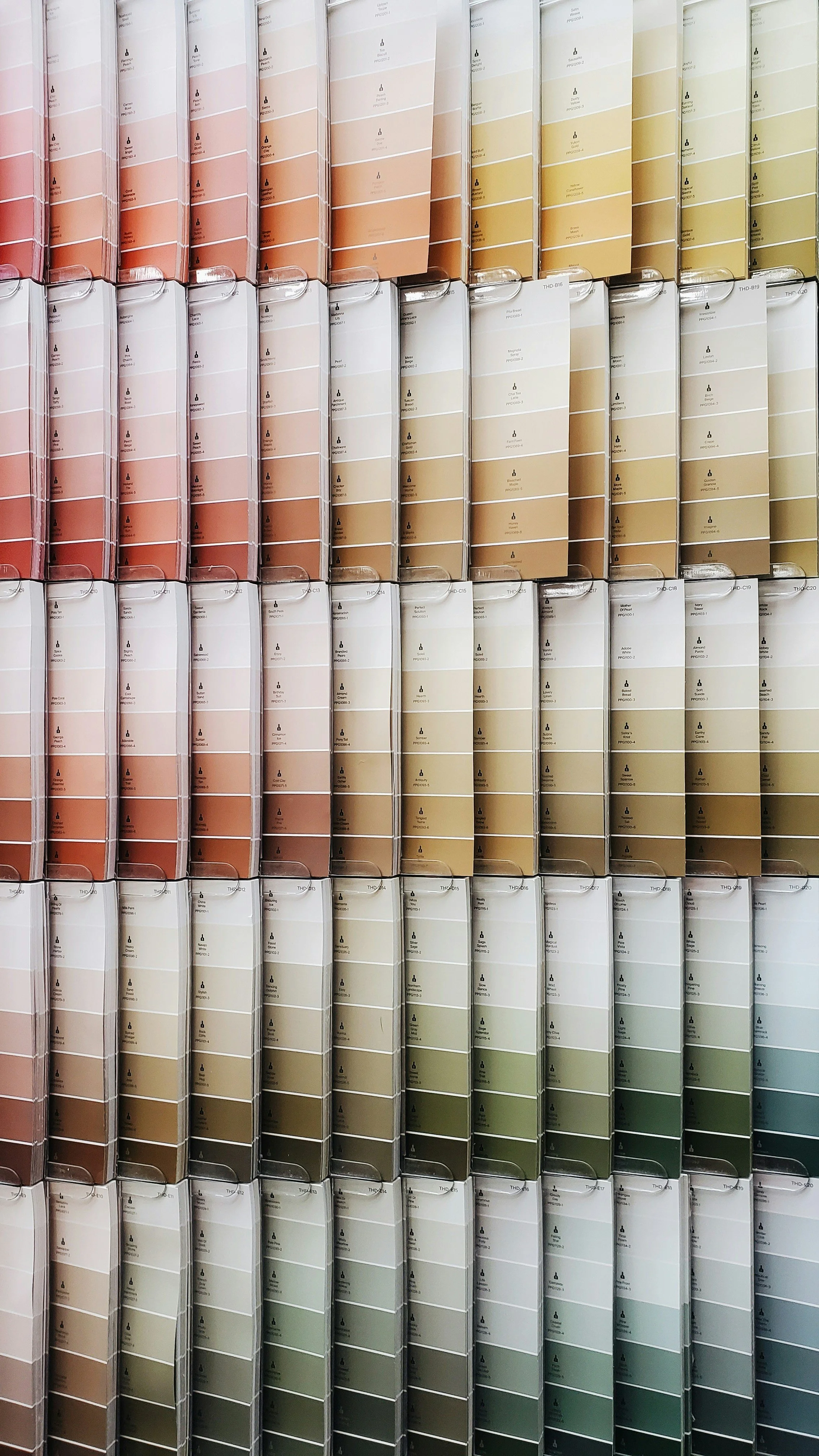
A common mistake when selecting paint colors is overlooking undertones. Every color has subtle underlying tones that can influence how it appears in different lighting conditions and against other colors.
To determine undertones, compare colors side by side against a true neutral shade like pure white. Testing samples in different lighting conditions throughout the day will also help you see how a color changes depending on natural and artificial light. Taking this extra step ensures that your final selection looks exactly as you envisioned.
5. Create Flow Between Rooms
A well-designed home should feel connected, even if each room has its own distinct personality. Creating a sense of flow between spaces helps maintain visual harmony and makes transitioning from one area to another feel natural.
One way to achieve this is by using a common neutral as a base color throughout the home. This can be a soft white, beige, or gray that appears in every room in some capacity, whether on walls, trim, or major furniture pieces. From there, you can introduce varying accent colors that complement one another while still allowing individual rooms to stand out.
6. Factor in Your Home’s Architecture
Your home’s architectural style should influence your color choices. A modern home with clean lines and open spaces may benefit from a minimalist palette of crisp whites and muted grays, while a historic home with intricate molding and rich wood finishes may look best with deep, traditional tones.
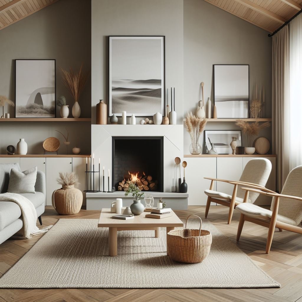
Farmhouse and rustic interiors often incorporate warm, earthy tones like taupe, sage green, and soft cream, while industrial spaces lean toward moody grays, blacks, and metal accents. Understanding how your home’s architectural features interact with color will help you choose hues that enhance rather than contradict its natural character.
7. Don’t Forget About Lighting
Lighting plays a crucial role in how colors appear in your home. A shade that looks warm and inviting in natural daylight may appear much darker or cooler under artificial lighting.
Rooms with north-facing windows tend to receive cooler, indirect light, which can make colors appear more muted. South-facing rooms, on the other hand, are bathed in warm, golden light, enhancing warm tones while sometimes washing out cooler hues.
Before committing to a color, test it in different lighting conditions throughout the day. Observing how a shade looks under both natural and artificial light will prevent surprises and help you choose a color that remains consistent in every setting.
8. Experiment Before Committing
Once you've narrowed down your choices, it's time to experiment before fully committing. Painting swatches directly on your walls allows you to see how a color interacts with your space, but you can also use peel-and-stick samples for a mess-free option.
Observe the color over several days, noting how it looks in the morning, afternoon, and evening. Colors may shift depending on the lighting, surrounding decor, and even the time of year. Taking the time to test your selection ensures that you’ll be happy with the final result before painting an entire room.
Choosing the perfect color palette for your home requires a mix of creativity and strategy. By considering color psychology, undertones, lighting, and architectural style, you can create a space that feels cohesive and inviting. Take your time, experiment, and most importantly, choose shades that make you feel happy and comfortable in your space.
Stay up to date with our latest ideas!