15 Neutral Paint Colors for a Stunning Kitchen Look
Transform your kitchen with these 15 neutral paint colors. From crisp whites to warm taupes, discover how neutral shades can elevate your cooking space.
Neutral paint colors might sound simple, but they’re anything but boring—especially when it comes to upgrading your kitchen. Think of neutrals as the blank canvas that allows your cabinets, countertops, and décor to shine. Whether you’re partial to a soothing gray or a creamy ivory, these shades bring out the best in any style, from rustic farmhouse to contemporary chic. You can even combine different undertones, such as warm taupes and cool whites, to create a balanced look that’s both inviting and visually striking. After all, the kitchen isn’t just a place to whip up meals; it’s where conversations spark, memories form, and creativity blooms. Why not treat it like a stage, where your personal flair and sense of comfort come together? Ready to explore some timeless neutrals that can completely transform your culinary haven? Let’s dive in!
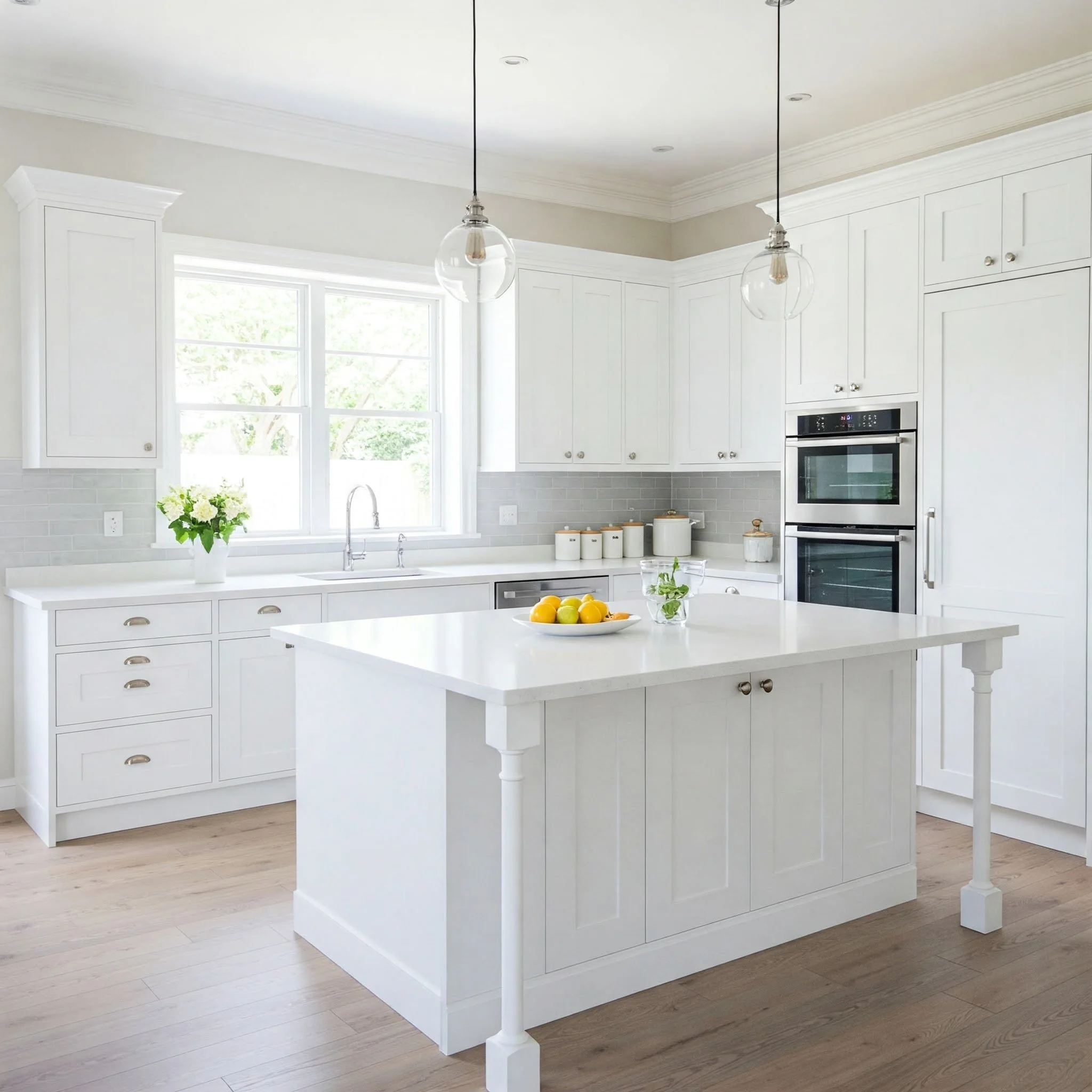
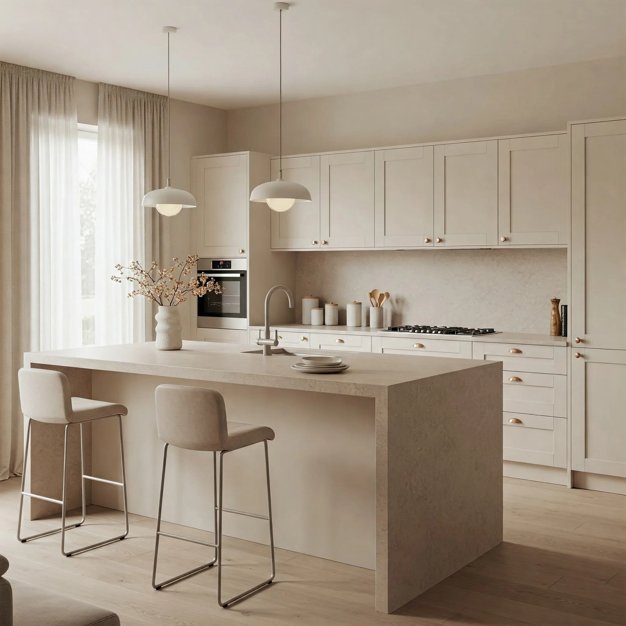
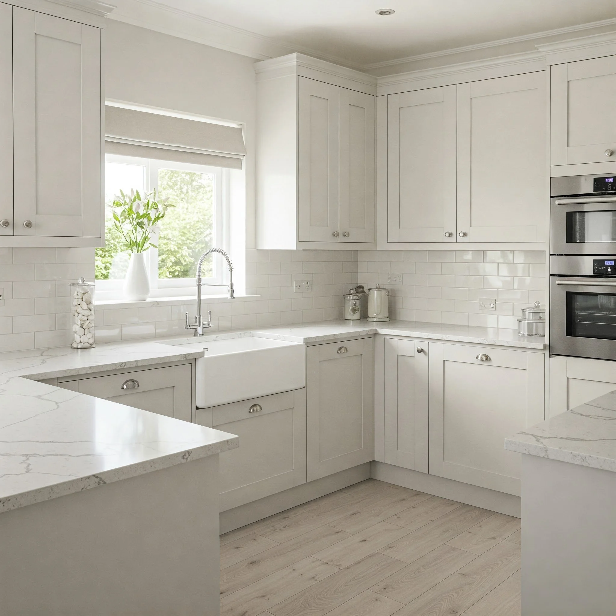
1. Crisp White Elegance
When you think of a bright, welcoming kitchen, white often takes center stage—and for good reason. A crisp white hue can make a smaller kitchen feel more expansive, almost like adding a skylight that floods the room with natural brightness. This color sets a clean, refreshing tone that works beautifully with various cabinet styles, from sleek modern lines to classic shaker designs. Think of white paint as a blank canvas where any accent color—be it a bold tile backsplash or vibrant barstools—instantly pops. Worried about it feeling too stark? Warm things up by pairing your white walls with wooden cutting boards, potted plants, or cozy textiles. White also reflects light better than any other color, which can help your kitchen glow like a sunny weekend morning. It’s the ultimate no-fuss choice, but one that never loses its timeless charm.
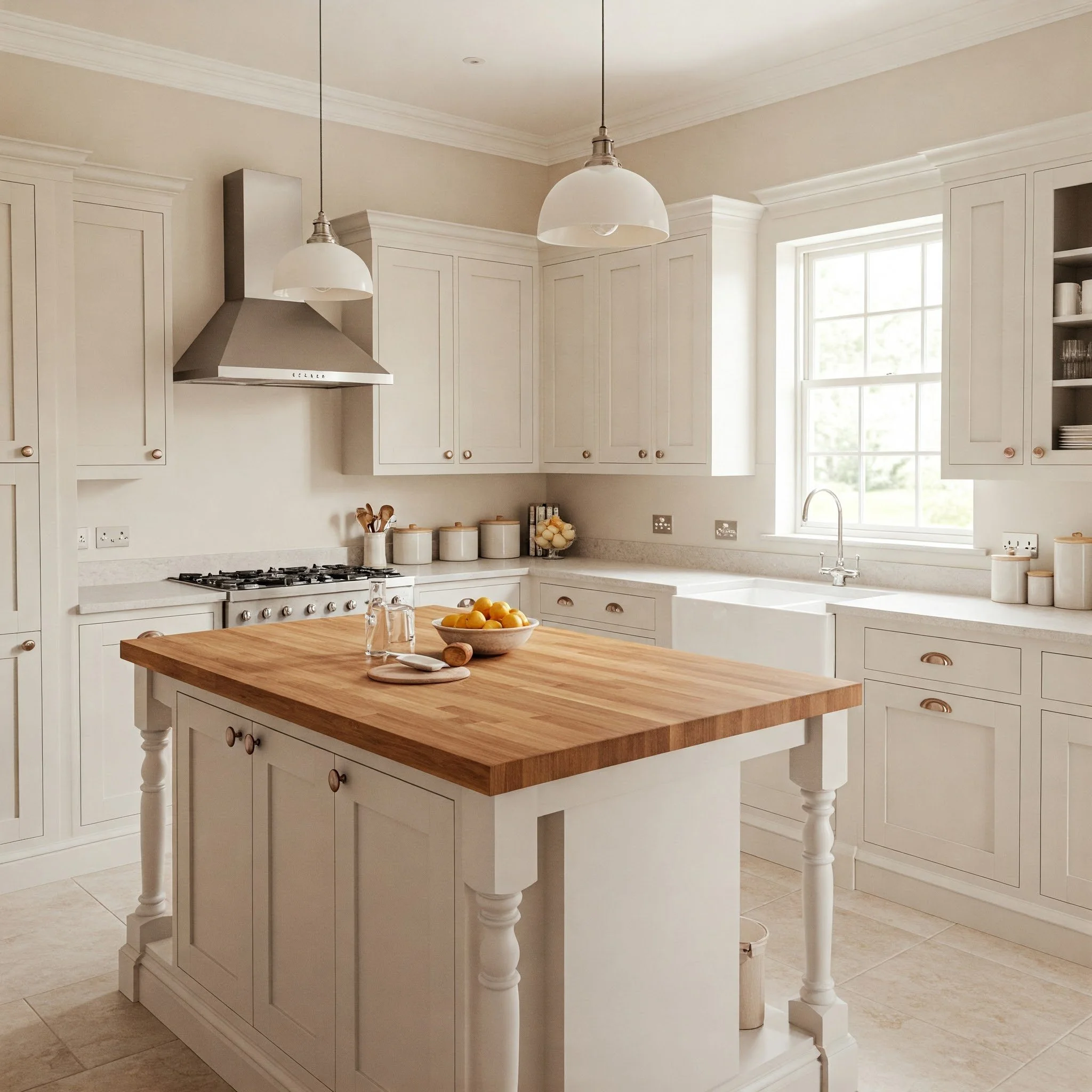
2. Cozy Cream Undertones
If pure white feels a tad too bright, why not lean into a creamier shade? Cream undertones introduce a velvety warmth that immediately softens the ambiance of your kitchen. Imagine the hue of whipped butter or the frothy top of a cappuccino—cozy, inviting, and effortless. A cream backdrop also pairs wonderfully with both natural wood accents and metallic finishes. Got brass hardware on your cabinets? Cream paint will amplify that subtle glow, making your space feel luxe yet approachable. This color is perfect for those who crave a warm atmosphere without drifting into more saturated territory. Plus, cream can mask minor scuffs and smudges more effectively than stark white. Consider adding some vintage-inspired décor or rustic shelving to complete the look. Like a comforting blanket, cream paint wraps your kitchen in understated elegance.
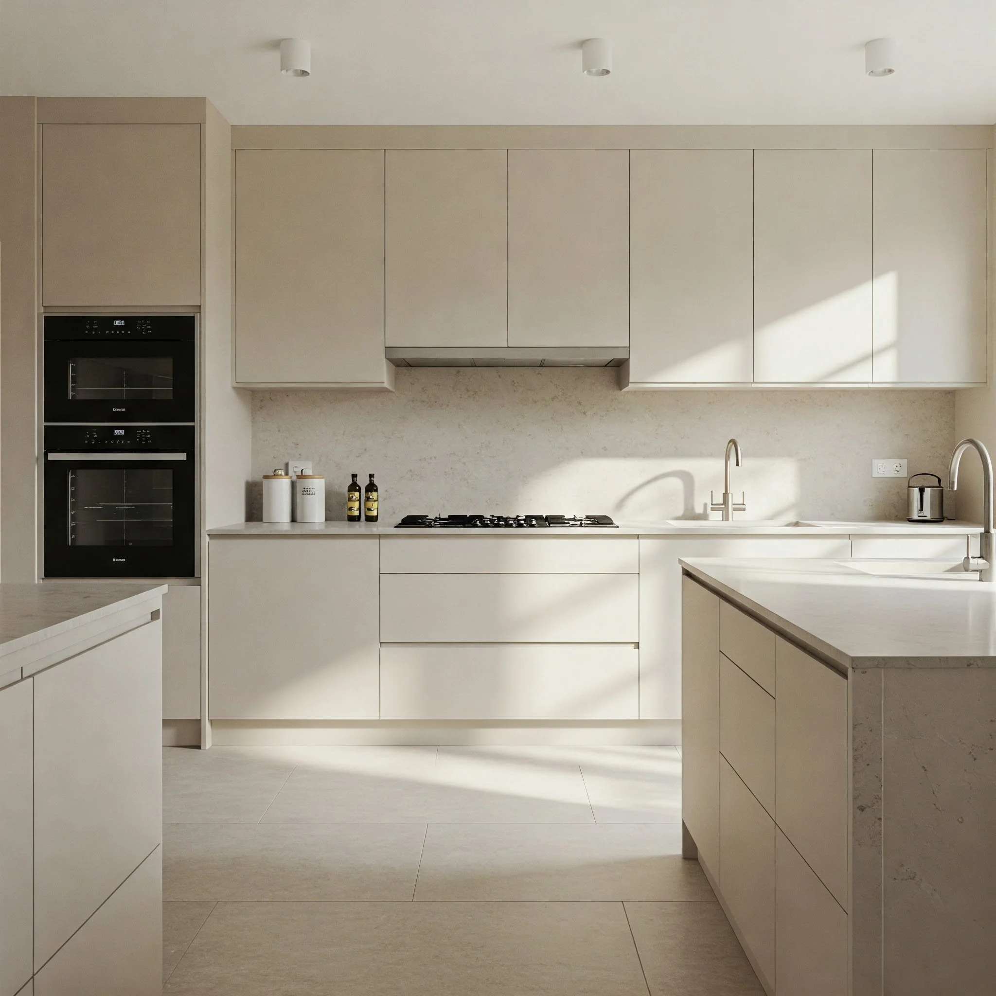
3. Soft Beige Beauty
Beige sometimes gets a bad rap for being “boring,” but it’s anything but dull when used effectively. Think of it as the neutral that sits between creamy whites and richer browns. If your kitchen is a social hub for family gatherings or weekend brunches, beige can serve as an inviting backdrop that harmonizes with just about any accent color. It’s like the dependable friend who gets along with everyone! Blend in some earthy accents—like terracotta planters or bamboo cutting boards—to elevate that natural vibe. Or, if you’re aiming for a more modern flair, pair your beige walls with black hardware and minimalist décor. The subtle warmth of beige also has a way of making a kitchen feel softer on the eyes, reducing glare and harsh contrasts. In short, beige is an understated superstar that’s ready to complement your culinary creativity.
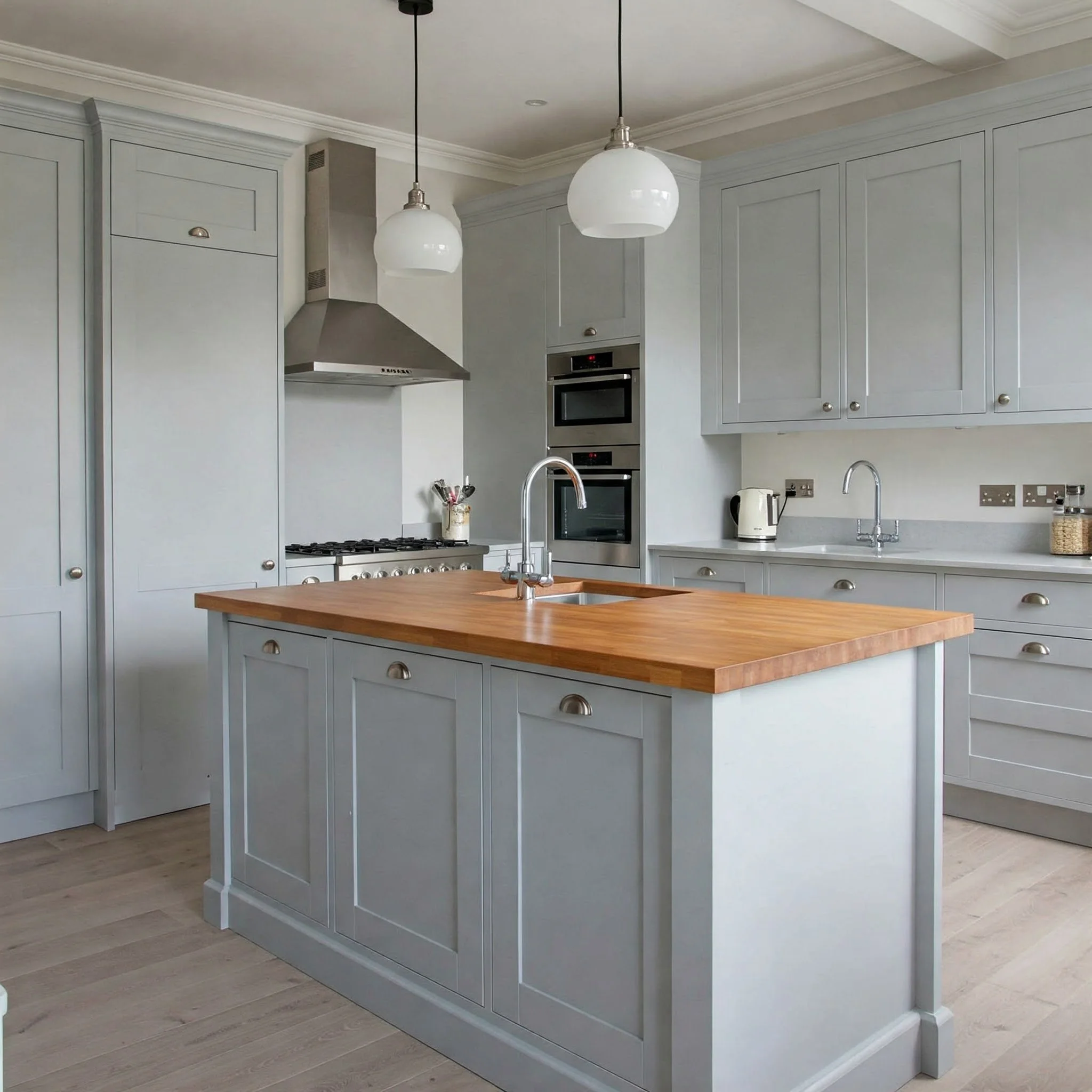
4. Gentle Gray Hues
Gray can be an absolute game-changer, especially when you crave a sleek, modern kitchen vibe. Unlike whites or creams, gray injects a cool sophistication that feels fresh yet timeless. Picture a morning scene where the soft gray walls reflect natural light, making your space look effortlessly refined. Because gray comes in so many variations—cool blue-grays, warm greige mixes, or steely graphite—you can easily find a shade that complements your countertops and cabinetry. Looking to jazz things up? Add pops of color with items like mustard-yellow dishware or turquoise accent pieces. Gray acts like a calm, soothing backdrop, allowing bursts of color to shine without clashing. It’s also more forgiving with stains and smudges than lighter neutrals, which is a bonus if you love to cook up a storm. With gentle gray hues, you’ll find a balance of trendy and timeless that’s hard to resist.
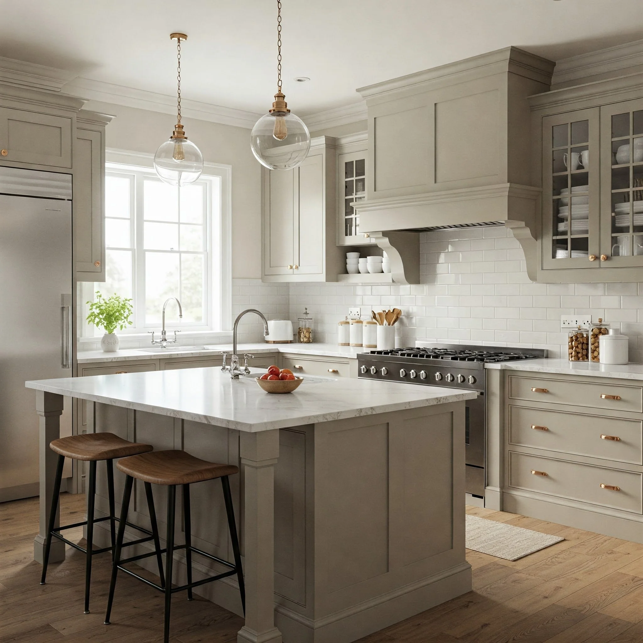
5. Timeless Greige Charms
Greige—a magical fusion of gray and beige—offers the best of both worlds. It takes the cozy warmth of beige and pairs it with the sleek elegance of gray, creating a color that feels both modern and welcoming. Imagine walking into your kitchen and feeling an immediate sense of calm, like stepping onto a sandy shore under a softly overcast sky. Greige also easily adapts to different décor styles, from minimalistic Scandinavian to farmhouse chic. If you’re someone who loves switching up accents with the seasons, greige is a chameleon, blending beautifully with everything from bright spring florals to autumn’s rustic hues. The versatility of greige also makes it an excellent choice if you’re planning to sell your home later; potential buyers often appreciate this neutral, balanced shade. In short, greige is a timeless crowd-pleaser that marries warmth and modernity in one elegant package.
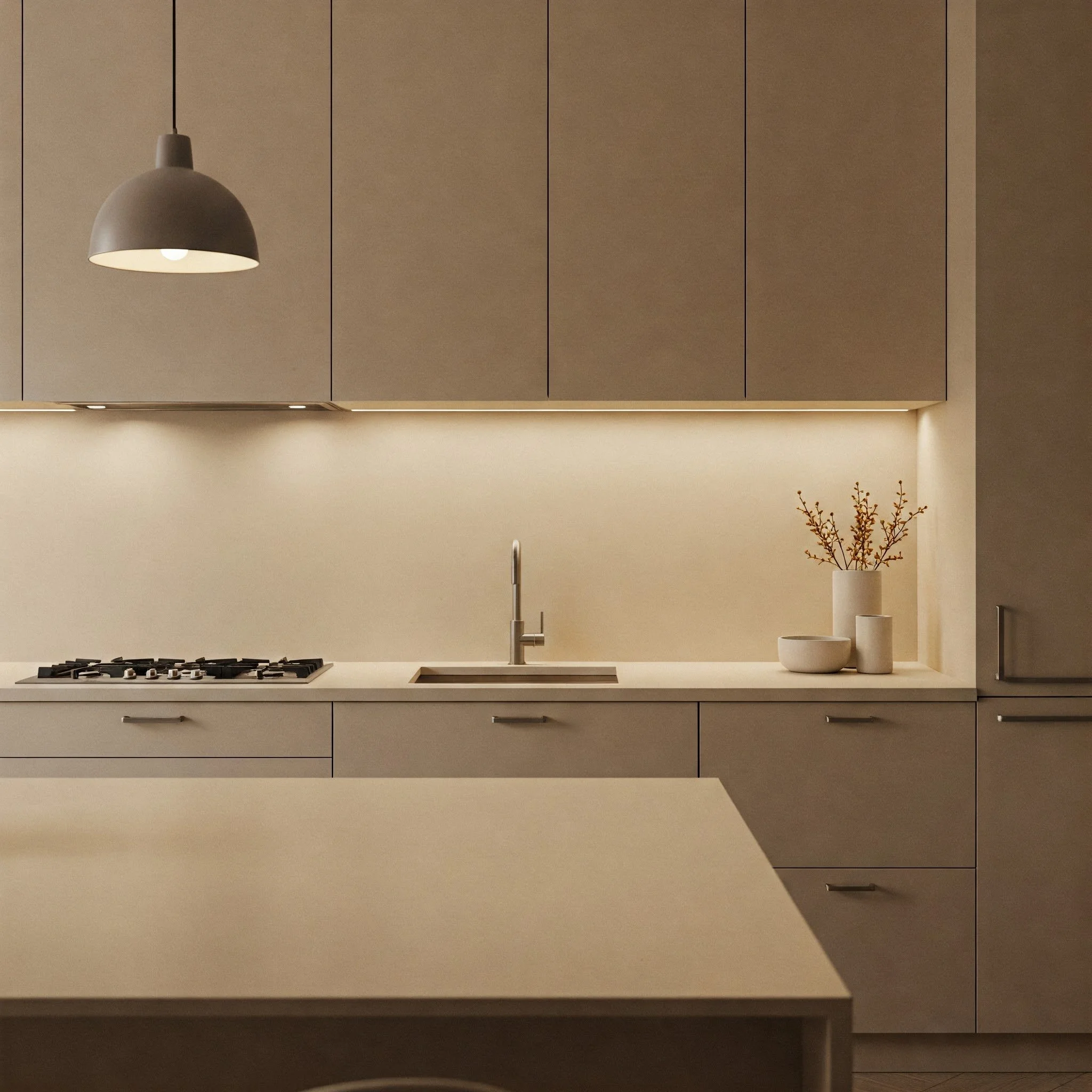
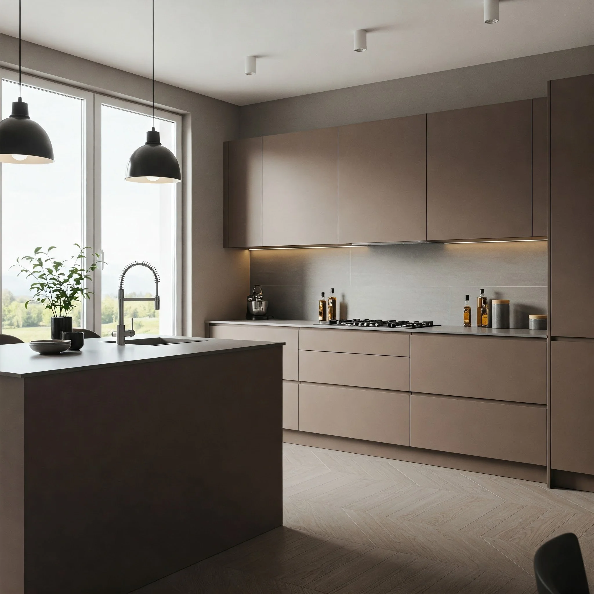
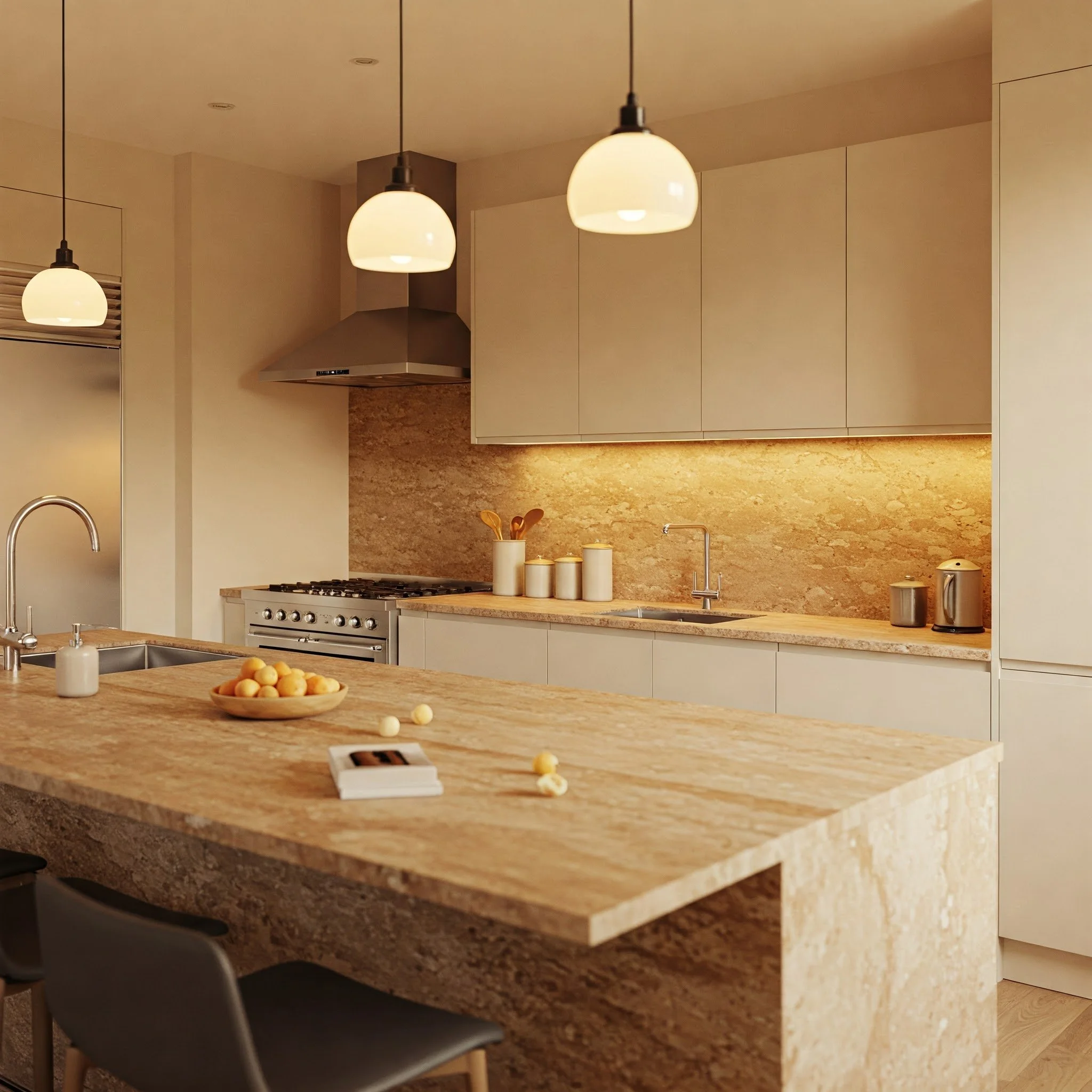
6. Warm Taupe Tones
Taupe might just be the hidden gem of kitchen color palettes. Nestled between brown and gray, taupe exudes an earthy warmth that can feel surprisingly sophisticated. It’s like a comforting embrace, instantly making your kitchen feel more grounded and serene. Pair taupe walls with crisp white trim for a striking contrast, or go for brushed gold hardware to elevate the sense of luxury. Love collecting ceramics and clay pots? They’ll blend seamlessly into a taupe backdrop, creating a cohesive, nature-inspired look. For a more contemporary approach, incorporate sleek metal stools or modern glass pendant lights—they’ll stand out brilliantly against taupe’s understated charm. What’s more, taupe can handle colorful artwork and bold decorative pieces without looking cluttered. If you’ve been hunting for a neutral that’s cozy yet refined, warm taupe might just be the ticket to your dream kitchen vibe.
7. Subtle Sand Hints
Ever dreamed of bringing a bit of beachy tranquility into your cooking space? Then a sand-inspired neutral might be right up your alley. Think of subtle sand tones as the color of sun-kissed shorelines—calming, soothing, and perfect for opening up a room. This hue is fantastic if your kitchen doesn’t get a ton of natural light, since the slightly warm undertone can help bounce light around, making the area feel brighter and more spacious. Subtle sand also pairs nicely with cool blues or seafoam greens if you want that laid-back, coastal flair. Alternatively, lean into warmer, burnt-orange accents for a desert-inspired palette that feels cozy and chic. Whether your style is breezy beach house or earthy boho, sand tones can serve as the quiet, stabilizing anchor that pulls everything together.
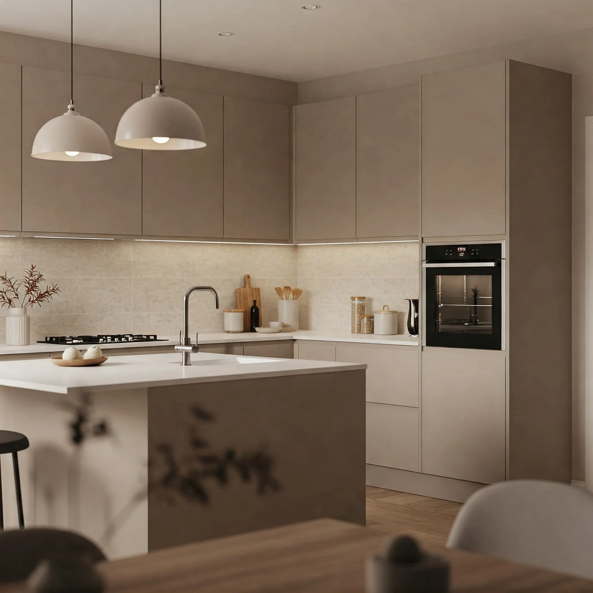
8. Modern Mushroom Shades
When you hear “mushroom,” you might think of earthy brownish hues—and that’s exactly what this neutral family offers. Modern mushroom shades lean slightly gray, giving them a refined, contemporary edge. They’re a bit darker than your classic beige or cream, which can add depth and richness to your kitchen without overpowering the space. Think about how mushrooms blend seamlessly into forest floors but still catch your eye with their subtle uniqueness. That same principle applies here: a mushroom-colored kitchen can highlight bright white cabinetry or even stainless-steel appliances. If you’re feeling adventurous, introduce touches of deep forest green or navy blue for a moody vibe that feels both modern and cozy. Mushroom shades also hide everyday marks better than lighter neutrals, making them a practical choice for busy families or avid home cooks.
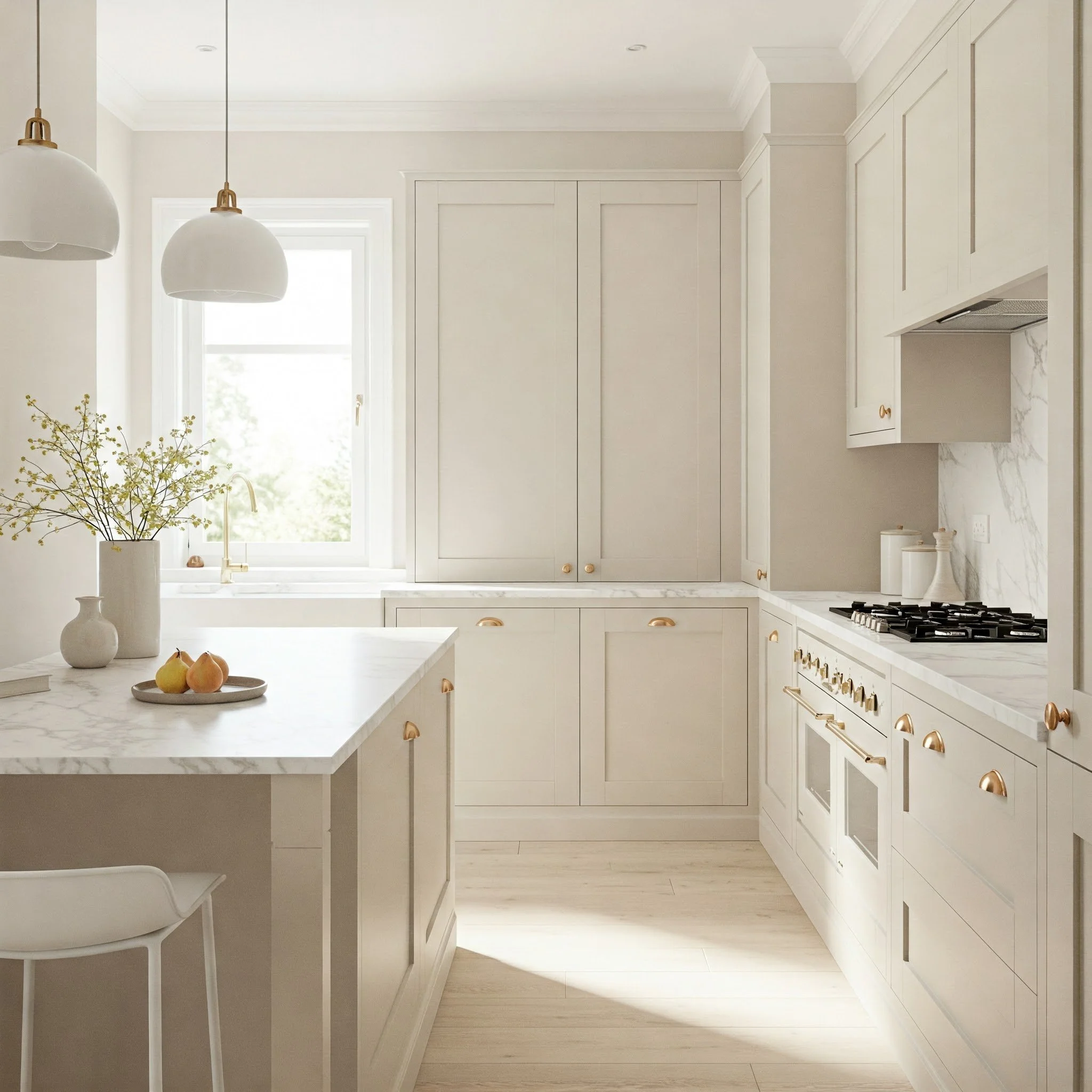
9. Delicate Ivory Nuances
Ivory is often seen as the classy cousin to white—softer around the edges but just as light-enhancing. If white paint feels too crisp and cream feels too warm, ivory can strike that perfect balance. Imagine the glow of a candlelit dinner captured on your walls; that’s the gentle ambiance ivory can provide. It brings a subtle opulence that’s reminiscent of vintage pearls or fine linens. Ivory also plays well with various textures—rustic wooden shelves, shiny brass fixtures, or even glossy subway tiles. Because it’s understated, it won’t clash with statement pieces like patterned backsplash tiles or bold-colored cabinet doors. Worried about your kitchen looking washed out? Incorporate darker countertops or vibrant accent rugs for contrast. Ivory’s nuance lies in its versatility: it’s graceful enough to be sophisticated but neutral enough to be a background player for bolder décor elements.
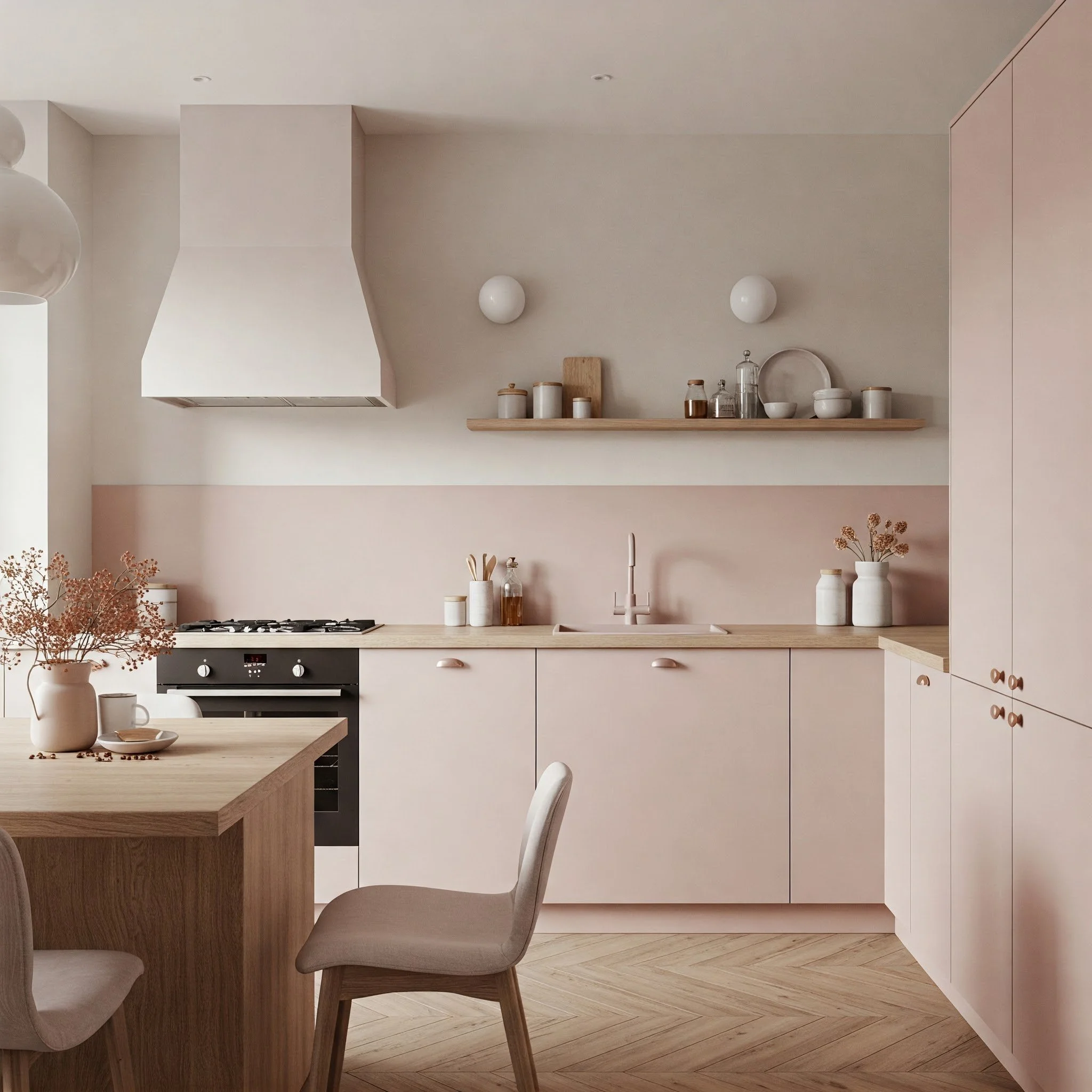
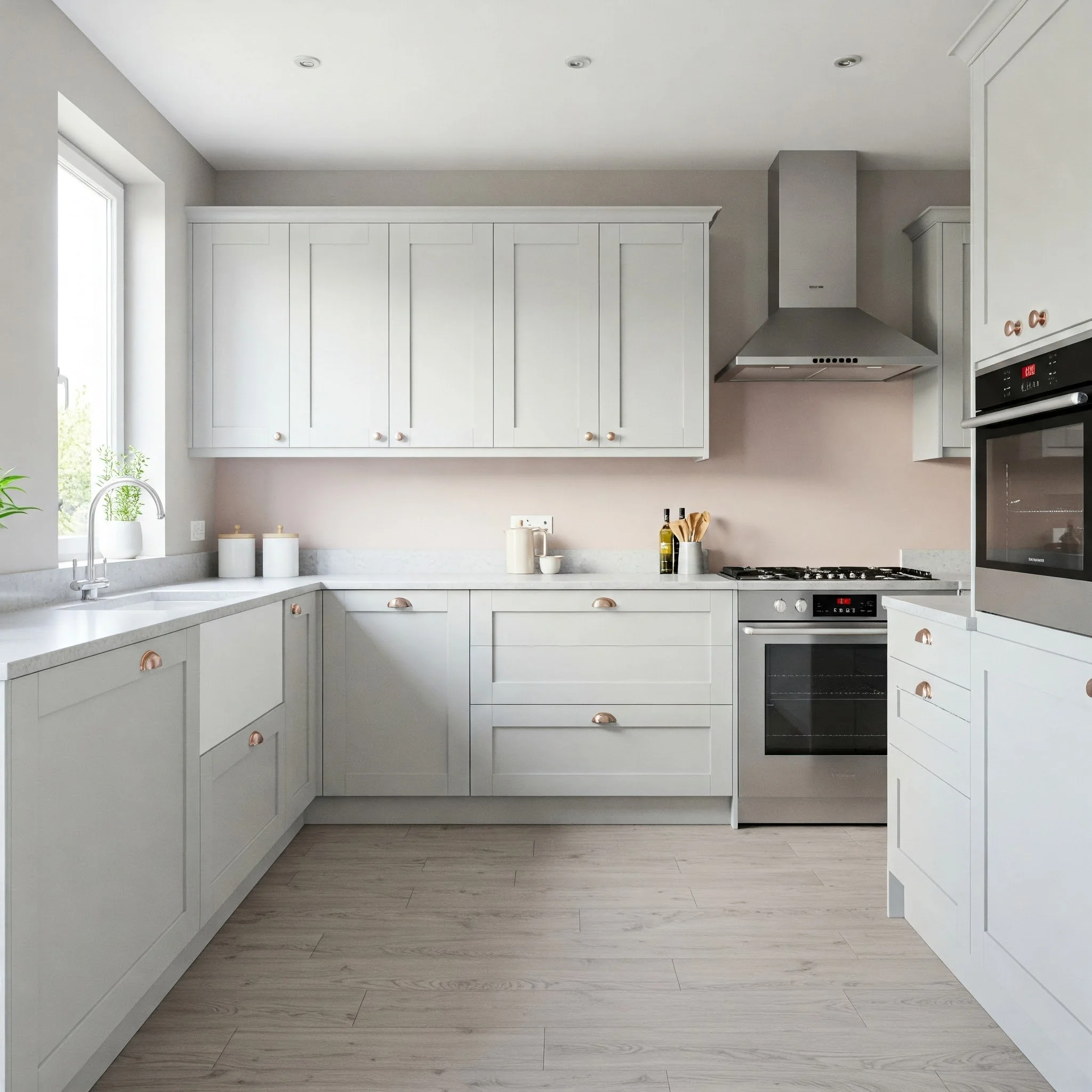
10. Whisper of Blush
Who said neutrals have to be strictly browns, whites, or grays? A whisper of blush—think the faintest tint of pink—can add a soft, romantic glow to your kitchen without veering into overtly feminine territory. It’s like a sunset’s gentle haze, wrapping your space in a calming warmth. This pastel neutrality works especially well with rose gold or copper hardware, creating a cohesive, dreamy vibe. Pair it with gray or white cabinets to maintain a balanced look, and consider adding natural textures like rattan barstools or woven pendant lights for an earthy contrast. The beauty of a blush-toned neutral is that it’s discreet enough to feel classic, yet unique enough to stand out. It’s perfect if you want to infuse a dash of subtle personality into your kitchen, turning every meal prep into a tranquil, uplifting experience.
11. Earthy Stone Appeal
Channeling the grounded feel of natural stone, these neutrals often lean toward cool grays and muted browns, reminiscent of river rocks or pebbled pathways. If your goal is to create a kitchen that feels anchored and organic, earthy stone shades could be your go-to. They evoke the comfort of a mountain lodge but can also be styled to suit modern, urban spaces. Think of it as a color that connects you to nature each time you step in to cook or entertain. It’s an excellent canvas for textured materials like reclaimed wood shelves or hammered metal light fixtures. Plus, stone-inspired neutrals help emphasize greenery and fresh produce, making your kitchen feel more alive. If you’re someone who finds solace in the great outdoors, bringing a bit of that earthy calm indoors might be the ultimate design choice.
12. Hints of Pearl Gray
Pearl gray is all about subtle luminescence, similar to holding a shimmering seashell up to the light. This hue has an almost translucent quality, giving your kitchen walls a gentle glow without looking washed out. If you appreciate modern minimalism but still want a touch of warmth, pearl gray offers the best of both worlds. It pairs seamlessly with stainless-steel appliances and glossy countertops, accentuating that sleekness. On the flip side, it also complements natural wood elements, revealing a cozy side to an otherwise cool color. Think of pearl gray as the quiet star of the show: it won’t steal the spotlight from your statement pieces—like bold artwork or colorful dishware—but it also won’t fade into the background. It’s that perfect neutral sweet spot that keeps your kitchen feeling fresh and airy all year round.
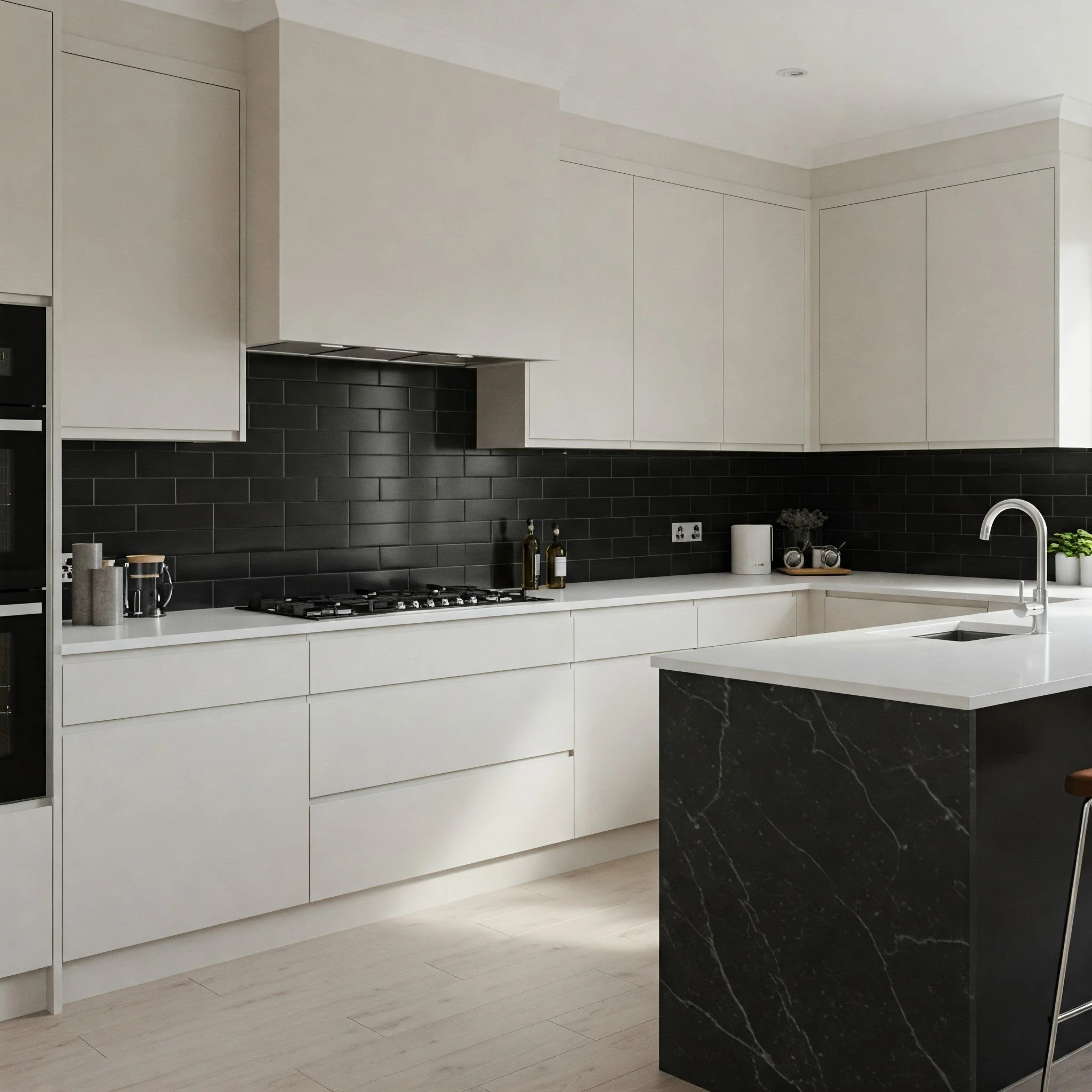
13. Bold Charcoal Touches
Ready to go a little darker? Charcoal tones can bring a bold, dramatic flair to your kitchen without losing that neutral magic. Think of it as the “little black dress” of paint colors—elegant, versatile, and always on-trend. Charcoal walls create a striking contrast with white cabinets, making them pop like bright stars against a nighttime sky. If your kitchen is large or gets ample sunlight, a charcoal feature wall can add depth and sophistication. The color also pairs beautifully with metallic accents—copper, gold, or stainless steel—instantly elevating the glam factor. Just remember, darker shades can make smaller kitchens feel more intimate, so balance is key. Introduce lighter countertops or open shelving to keep the space from feeling too enclosed. For those unafraid of a little drama, charcoal brings timeless allure with a dash of daring.
14. Harmonious Pastel Neutrals
Neutrals don’t have to stick to the usual suspects of beige, gray, or white. Pastel-toned neutrals—like a barely-there mint or a soft lilac—can work wonders for creating a refreshing, airy kitchen. It’s like adding a gentle breeze of color that doesn’t overpower the senses. These hues subtly shift based on the lighting, sometimes leaning more neutral and other times revealing a delicate tint. Pair pastel neutral walls with natural wood or wicker elements to channel a farmhouse flair, or combine them with sleek metallic finishes for a modern twist. The beauty is in their versatility; they can be as subtle or eye-catching as you want, depending on your accents. If you yearn for a hint of color but still crave the ease of a neutral backdrop, a pastel neutral might be your perfect middle ground.
15. Understated Off-White Blend
If you love the crispness of white but crave a slight twist, off-white blends can be your new best friend. These nuanced neutrals incorporate just a hint of color—be it gray, beige, or even green—creating a layered look that shifts with the changing daylight. Imagine the subtle variance of clouds on a breezy afternoon, shifting between bright white and gentle shadow. An off-white backdrop can make your kitchen’s architectural details stand out while still keeping the overall vibe light and airy. Plus, it’s an incredibly forgiving color if you’re worried about minor messes that inevitably happen in a busy kitchen. With the right lighting, off-white can glow warmly at sunset and appear refreshingly cool at midday. It’s a chameleon that complements a variety of design elements, from rustic wooden beams to contemporary stainless-steel appliances.
Conclusion
Choosing the perfect neutral paint color for your kitchen is like finding the right soundtrack for your day: it sets the mood, influences your energy, and can even inspire your culinary adventures. Whether you’re drawn to the bold depth of charcoal or the soft embrace of a sandy beige, neutrals offer you a versatile canvas to showcase your personal style. They work in harmony with colorful dishware, statement backsplashes, and even those quirky collectibles you’ve gathered over the years. Think of your chosen shade as the quiet hero of your kitchen’s story, letting the details you love truly shine. And the best part? Neutral colors rarely go out of style, so you’re investing in an enduring look. Once you’ve narrowed down your favorites, don’t hesitate to try out test swatches—you might just discover the shade that makes your kitchen feel like home sweet home.
Read next: 15 Neutral Room Ideas for a Timeless Look
Frequently Asked Questions
1. Can I mix different neutrals in the same kitchen?
Absolutely! Combining multiple neutral shades—like a lighter color for the walls and a slightly darker hue for the cabinets—creates contrast and visual interest without clashing.
2. Will a darker neutral color make my small kitchen feel cramped?
Not necessarily. A well-placed darker neutral can add depth and warmth. Just be sure to balance it with lighter accents or plenty of natural light.
3. How do I prevent my neutral kitchen from looking bland?
Use a variety of textures and finishings—think wood, metal, and glass accents—to introduce depth and sparkle, even within a neutral palette.
4. Is it better to test paint colors under different lighting conditions?
Yes! Paint can appear drastically different in natural daylight versus artificial light. Always check swatches at various times of day.
5. Are neutral kitchens still trendy, or should I go bold with color?
Neutral kitchens are timeless. They offer a versatile foundation that can be easily updated with colorful accessories whenever you want a fresh look.
Stay up to date with our latest ideas!